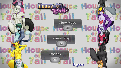
HoT Logo and Title Screen
January 30, 2013 in Games, House of Tail
Finally got around to designing HoT’s logo…

The aim was something simple, classy, and ‘screams porno game’.
I know the easy-out would have been to do something with the “Tail”, like drawing an actual tail underlining the logo, but it’s too expected, right? I think this works better, playing on expectations, being subtle and leaving the graphic details to, well… the graphics.

(click to view full sized image)
Screenshot of the title and main menu, (what I’m working on this week.)
The background and character columns scroll, and buttons float into position, all making it rather lively. I hope you will appreciate the little touches, have been putting my hands all over the code~ In a completely professional way, I assure you.


Looks great! .. and so does the title screen. <u<
*shot*
Anyways, wanted to let you know that if you have any alternative way that doesn't require some … off site for me to give you the .FLP files ;u; then you can finish your music C:
Woot, great lookin’ title screen. It actually looks like a legit game menu, which I do assume you were going for.
Am just glad you didn’t add a tail to the logo or anything, I remember actually wondering to myself couple months ago if you were going to take the easy way out and just add a tail to the logo. 😀
-Keto
title looks great, can not wait to play it!!
There isn’t much to say about a title screen but at the same time credit where credit is needed, this looks like a professional game title screen.
Wow it’s an honor to be featured on the title screen.
Thanks so much! =3
Will post this up on my FA if that is alright?
Sure thing 🙂
Uploaded a full-sized version, which you may want to use instead~
http://fupoco.com/images/journal/hot_title_screen_fullsize.jpg
Awesome thanks.
And as always will give you the credit. 😉